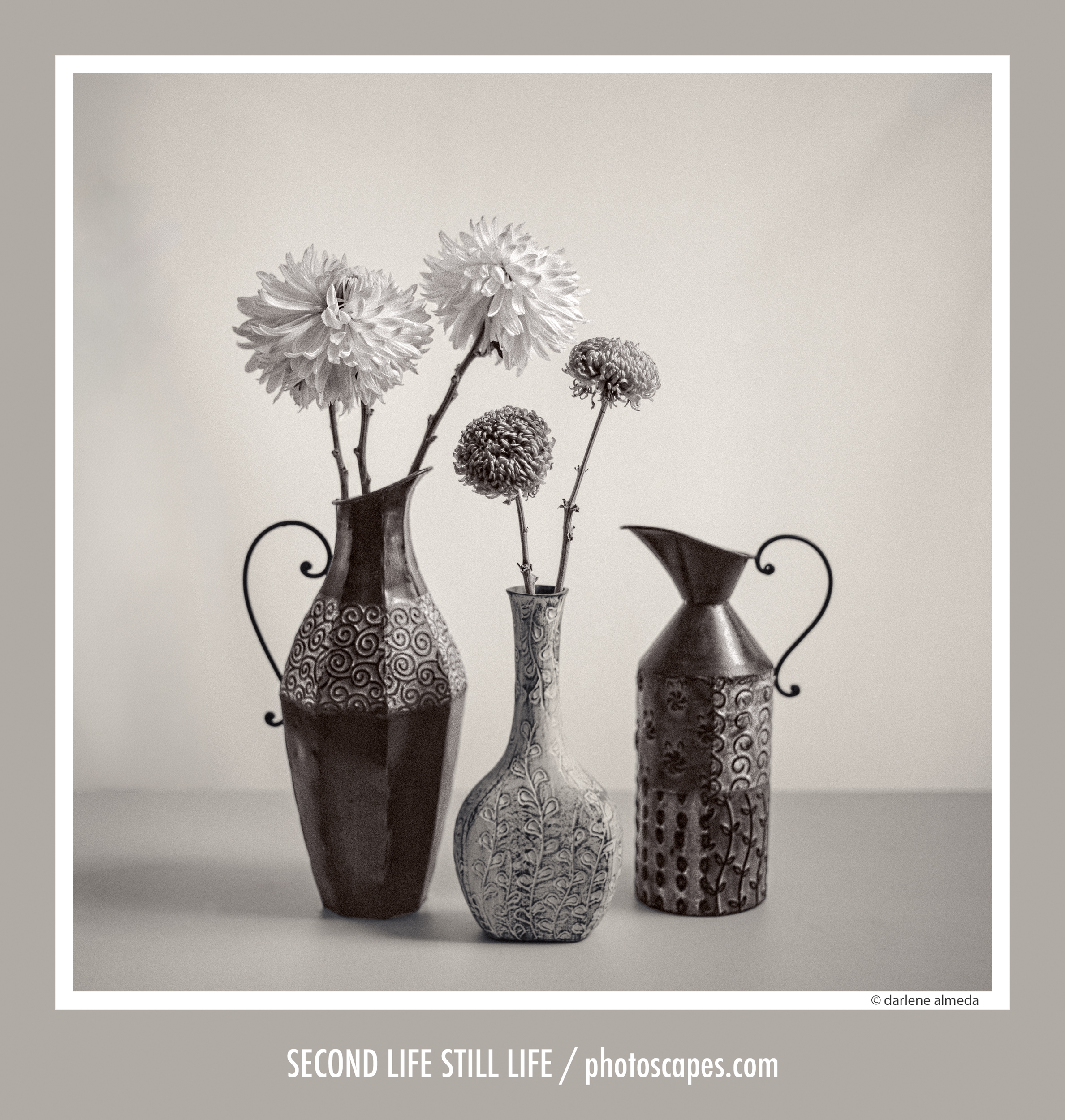
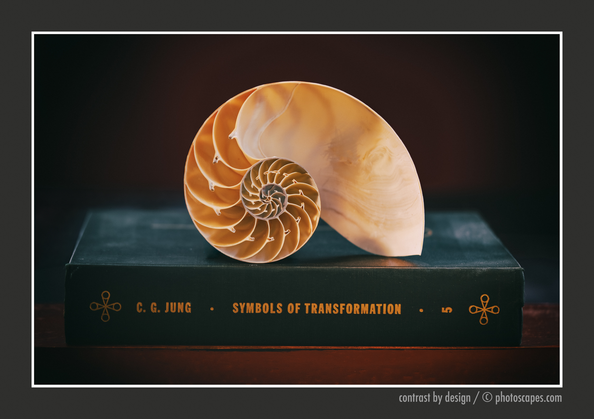
Same flowers, a different thought
The day before I made Second Life Still Life, I was in the studio with the same bouquet of mums. The light was soft, the room was quiet, and it felt like one of those days where you simply play and see what happens.
It was the green mums that caught me.
They’re a little unusual. Not loud, not shy, just different. When I picked them up at Publix, the cashier paused and said she had never seen anything like them before. I smiled, because I was thinking the same thing, and that made me feel they were worth the effort I was about to put in.
Back in the studio, I reached for a favorite vase, something with a bit more weight than the glass pieces that fill my shelves. I placed the stems loosely, letting them fall into place before making small adjustments. Nothing forced. Just that quiet rhythm of looking, moving, and looking again.
The green mums weren’t taking center stage among the jumbo yellows, and that didn’t quite sit right with me. Their graphic, circular form ‘spheres’ wanted more attention, even if I wasn’t ready to give it yet.
Eventually, the arrangement settled into a more traditional composition.
I made the exposure and worked through the roll, finishing with a close up using the CFi 120/4 macro lens, but I felt there was more I needed to work with here. I tend to shoot two rolls of 120 in the studio, partly because my developing tank holds two, and partly because it keeps me from rushing.
And I did like the image when I saw it through the viewfinder.
The tones felt right, the arrangement held together, everything in its place. But those green spheres, they lingered. Something about them felt unresolved, as if they were quietly saying, you’re not quite done yet.
So I left them.
The next day, I came back with a different eye. This time, a tabletop arrangement with thrift shop pitchers and a vase began to take shape, and those little green spheres found their place. That second pass would become Second Life Still Life.
But this first image stayed with me.
When I can’t title an image, it isn’t finished, and sometimes it never is.
It now sits in my Lightroom catalog as I start and stop the process of hand coloring. I build color slowly in Photoshop, using layers to introduce tone and warmth. If I move too quickly, the image pushes back, so I’ve learned to take my time, and occasionally walk away when it’s had enough of me.
In some ways, it reminds me of coloring books.
As a child, I would lie on the floor while my mom colored beside me. She taught me patience, how to stay within the lines, and how to build color slowly. She was an artist in her own way, though a mom first. Through coloring books and tracing paper, she was quietly teaching me how to see, understand color, and draw.
She also had a gift for arranging flowers.
No matter how tight things were, there was always a vase of fresh flowers on the kitchen table. She would step into the garden and return with something beautiful. Looking back, I suspect my love of flowers began there, long before I ever told a bouquet what to do.
I’ve included a screenshot of the hand coloring as it stands. I may start over, and truthfully, I prefer the black and white version. If the color doesn’t bring a sense of nostalgia, I usually let it go, and I’m not quite feeling it here. Still, I wanted to share the process.

I begin with a finished black and white image as my base. I choose a loose color direction ahead of time, sometimes referencing a quick phone snapshot, sometimes not. Changing the colors is part of the process, a bit like practicing scales.
From there, I select a few base colors, in this case yellows, greens, and blues, with a touch of violet for the vase. I duplicate the base image and introduce color through saturation layers, adding and removing it with a pen and tablet. It’s not so different from those childhood coloring books.
When I taught Photoshop, students often noticed that I work with a tablet on my lap rather than on the desk. I never look at it. My eyes stay on the screen. After going through more mice than I care to admit, I’ve learned my lesson. Use a tablet, your mouse will thank you.
Over the years, I’ve used both large and small tablets. Lately, it’s been a small Wacom that’s now out of production. No buttons, no extras. Just the pen.
Much like my cameras, I prefer to keep things simple. I think of it as driving a stick shift… fewer parts, fewer things to break, and a little more connection to the process.
Looking at the black and white beside the color, I’m reminded that a photograph doesn’t always finish in a single moment. Sometimes it takes a second look. Sometimes a second day.
And sometimes, it just takes a few stubborn green mums that refuse to be ignored.
Where I Left It

I find myself returning to this first image and, in many ways, preferring it. It feels quieter, more settled, as if it already knew what it wanted to be.
Not every photograph needs to move forward. Some simply mark a moment in the process, a place where you paused, looked, and learned something along the way. And that is never a waste.
Some images deepen with time. Others gently return you to where you began. Either way, there is something to be gained in the looking.
Next post, I’ll share a behind the scenes look of the final shoot, processing notes, including how I join two 120 rolls into one for quicker digitizing, along with two additional images, and the contact sheets.
I’ve sent the Second Life Still Life file to a lab for printing, crossing my fingers that I’ve found a pro lab here in North Florida that can print to my liking. In the meantime, I’m dusting off the mat cutter and have ordered framing boards and clear bags in preparation for making and donating prints.
I haven’t been this excited about making prints in years.
It feels good to be back at it.